Colour Psychology: What The Colour of Your Restaurant Means

By Alliance Online (www.allianceonline.co.uk)
As a restaurant owner you’ll no doubt have put a serious amount of time, energy, and money into the interior design of your establishment. But what does the colour of your restaurant mean? And, more importantly, how does it make your customers feel?
Colour psychology is the study of how colours can affect people, and the different subconscious associations we have with each shade and tone. So, hospitality and catering suppliers Alliance Online have looked into colour psychology to determine what the colour of your restaurant may be telling your patrons about your business.
Red
Red is perhaps the most stimulating colour you could choose to decorate your restaurant with. It is very eye-catching, and it is often associated with physical energy and alertness — which is probably why it is so often used in fast food and takeaway branding. However, there are romantic connotations to the colour red, too, which make it the ideal option for cosy dining rooms, and it is also the colour most associated with stimulating appetite. So, in many ways, it is the perfect choice for restaurants!
The downside to using red in your interior design is that too much of it can sometimes lead to subconscious feelings of aggression, so it’s best used as an accent colour rather than your primary shade.
Orange
Orange is a colour that is said to encourage teamwork and openness, so if you’re looking to create an atmosphere of friendliness among your staff and customers, this is the right colour for you. It’s best used in tapas or small plates restaurants, or simply those with a more laid-back feel. Warm and joyful, it can invoke feelings of sociability and encourage conversations in your restaurant, so it’s more suited to a room with dining tables than fast-food counters.
However, as orange contains the colour red, it could similarly be perceived as overwhelming to some people if overused.
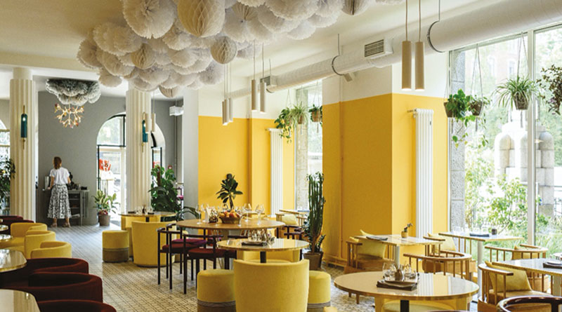 Yellow
Yellow is said to stimulate serotonin (the ‘happy’ hormone) in our brains, so it’s a great colour for fun restaurants such as burger bars or family-style eateries. Use yellow wherever you want to promote cheeriness and laughter — if you specialise in fine dining, you can opt for a pale yellow to provide an upbeat atmosphere while keeping your design sophisticated.
As with red, there is a downside to doubling down on yellow décor. Studies have shown that too much yellow could have almost the opposite of the desired effect, including hyperactivity and becoming overly emotional. So, you might want to consider a yellow feature wall rather than painting all the walls of your restaurant, or to try decorating with yellow accents.
Green
Green is a colour of harmony, neutrality, and balance, so it’s always been considered a safe option to decorate a restaurant with. However, more recently, it has even more potential to be beneficial for your business. Healthy eating, veganism, and sustainability are more on trend now than they have ever been, so if your restaurant ticks any of those boxes, it makes sense to advertise that to potential customers with a green colour scheme.
Another great thing about green is that there are so many shades to choose from, from bold emerald to pale mint, olive, and seafoam — though it’s best to stay away from ‘sickly’ yellow greens that might remind people of illness. Plants, living walls, and herb gardens are a particularly safe way to bring green into your establishment, especially for vegan or eco-friendly restaurants.
Blue
Blue is an extremely popular colour in interior design as it promotes rest and calm, making you feel safe and even sleepy in the right circumstances. As a result, restaurants tend to shy away from it and choose more upbeat, stimulating colours instead. This is probably for the best, as it has also shown potential to be an appetite suppressant.
That’s not to say that blue should never find its way into restaurant décor, however. If you want to create the kind of establishment where people go to unwind and relax, it can help relieve their stress and evoke feelings of trust — perfect for encouraging repeat custom.
A bright, fresh blue can also remind people of being on holiday as it is reminiscent of the sea and clear, sunny skies, so if you’ve chosen blue for your restaurant, you shouldn’t necessarily reconsider you decision.
Rachael Kiss, Marketing & Online Manager at Alliance Online said:
“It’s interesting to know that you can use colour schemes to influence the way people perceive and respond to your hospitality business. When decorating, think about the USP of your restaurant and the mood you want to create, then choose colours that reflect those.
“Your brand colours should be a jumping off point to ensure consistent branding — but remember that each colour can also have a negative association when overused. Bold colours, such as red, may be better off incorporated as accent colours.
“Opportunities to include accent colours include feature walls, artwork, and furniture, but also your crockery, cutlery, and napkins can be used to provoke the mood you want to.”